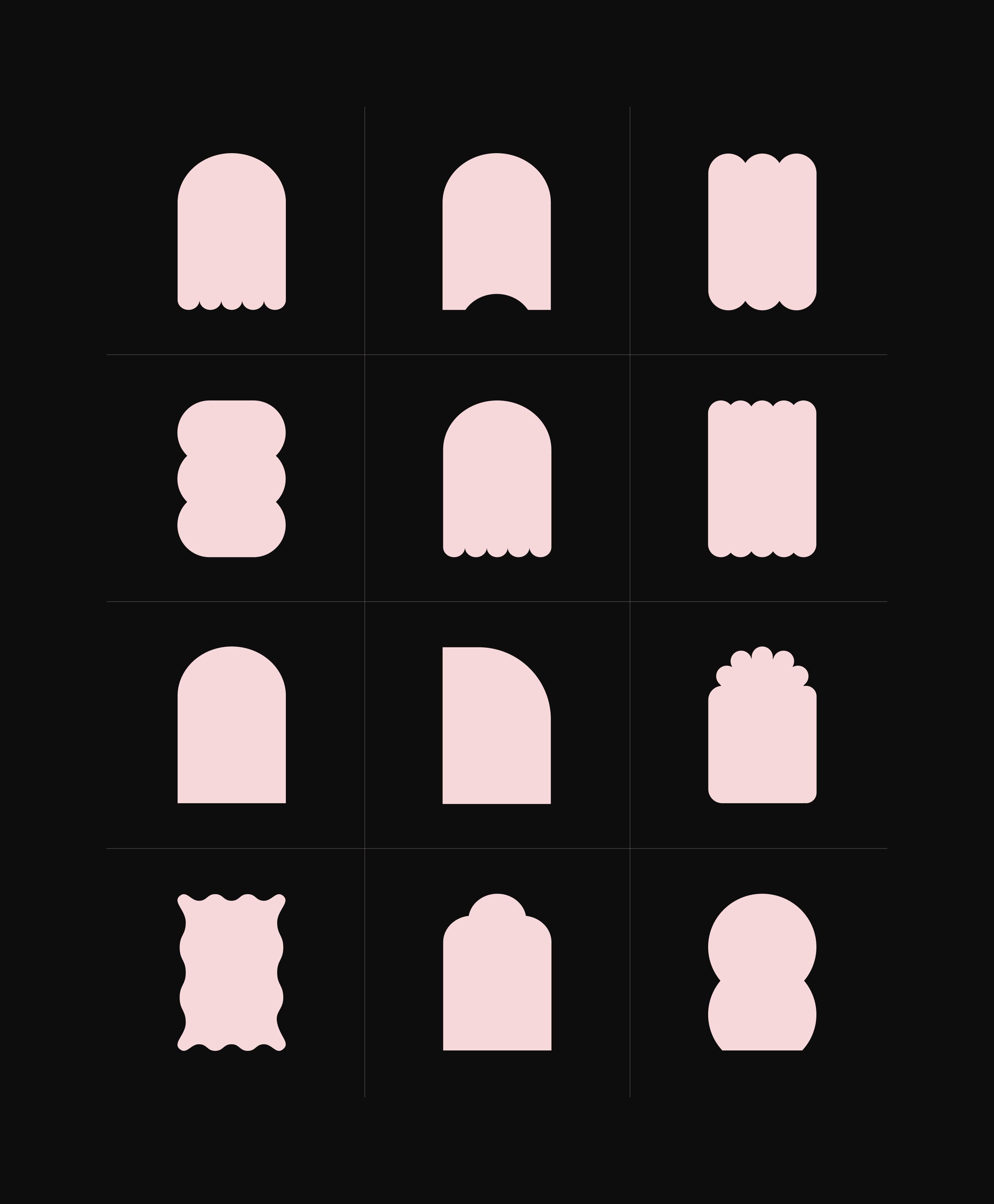
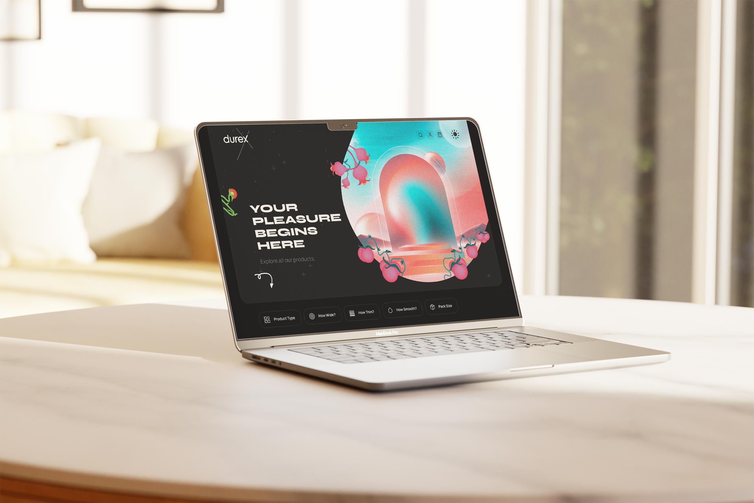
The goal of the project was to reposition, renew and redesign the durex e-commerce website. It was important to create an innovative user experience through visuals, composition, color, motion and typography to appeal to the target audience of 18-25 year olds. The starting point was an oval, cylindrical geometric shape as an obvious association with the product. This graphic element was further developed in an additional symbolic context, which was used as an introductory, hero graphic. The whole scene served as a kind of altar, an entrance to the dimension of pleasures presented in a semi-realistic context. It is also intended that with each click and each selection of a new product, there will be an interaction that will "communicate" with the user in the form of a written message.
The very beginning of the project was particularly demanding because it did not have a project specification nor was it supported by a vision to organise it. Taught by previous experiences, I realised that the very beginning should be an extensive research of all interactive and functional groups of the application. In this way, it was much easier to spot, count and improve all functional elements, such as buttons, form selectors and other similar elements, which later made up a comprehensive design system. It was easier also to manage and improve the user experience in the parts of the application that are crucial for users, and which presented great difficulties and created problems such as registration, booking meetings, creating and editing user profiles, participating in online and hybrid sessions, video meetings, video conferences.
Project Credits
Project Services
Digital Brand Development, Website Design
Project Team
Danijel Snjegota
Project Roles
Multimedia Designer