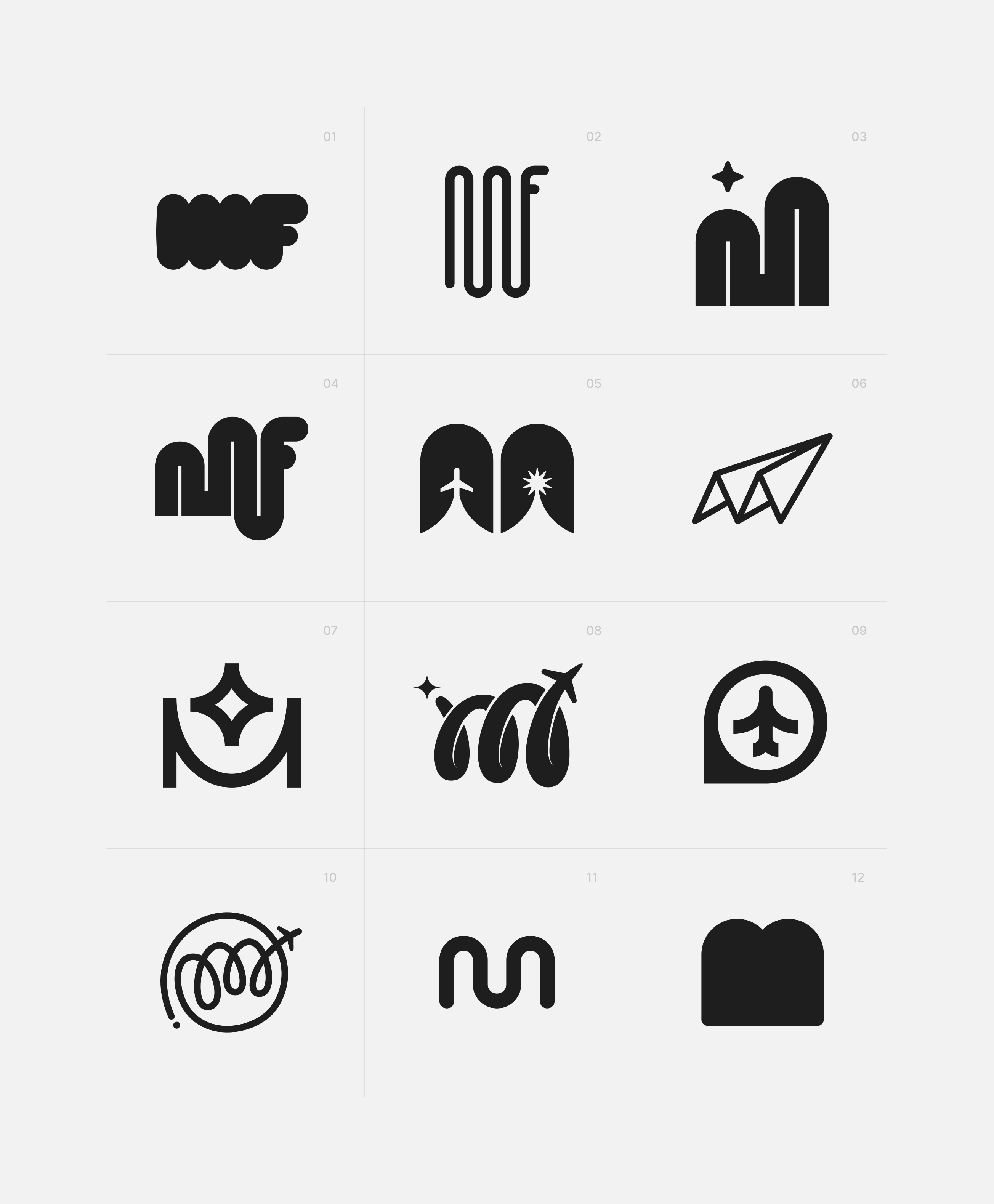
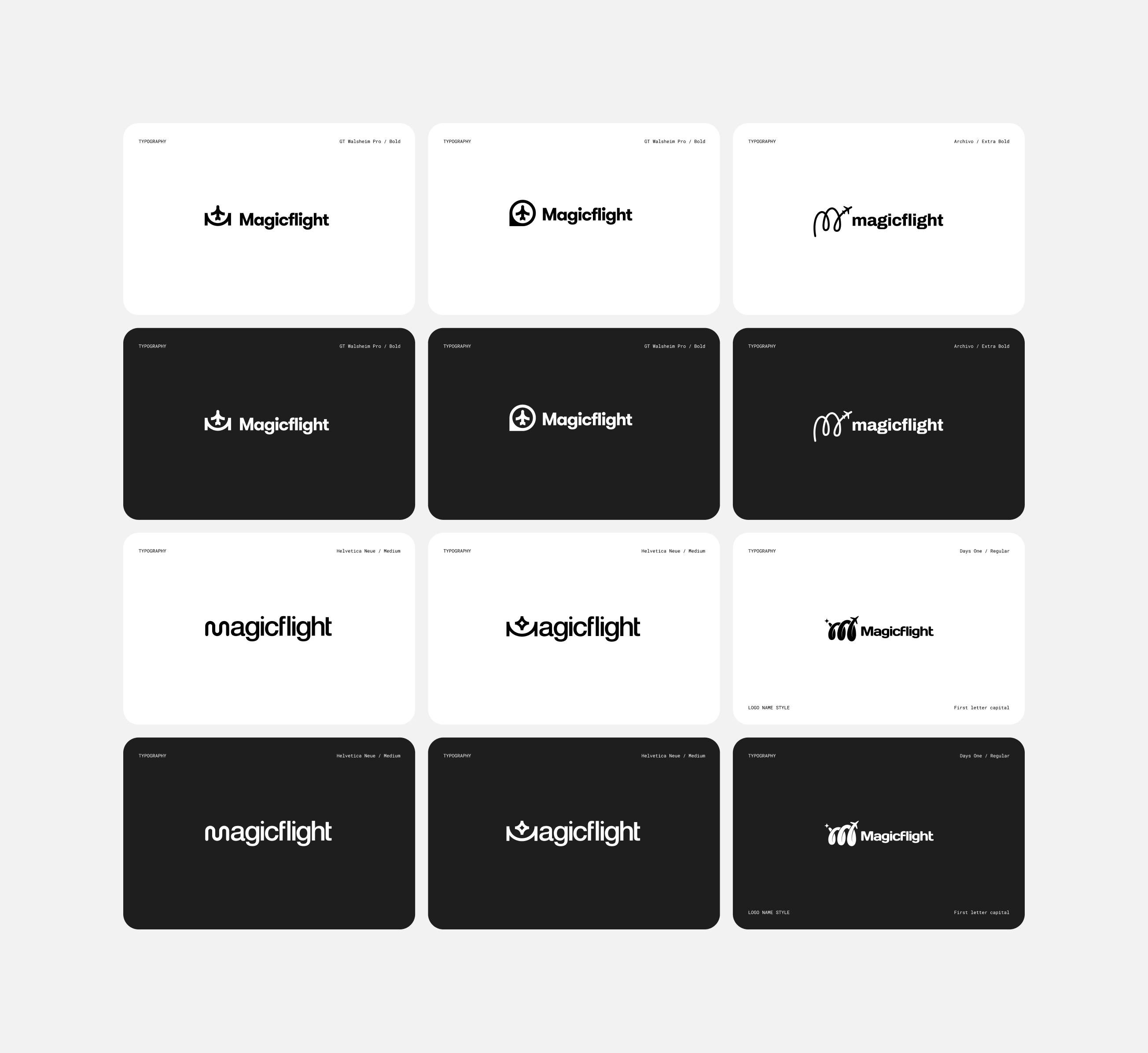
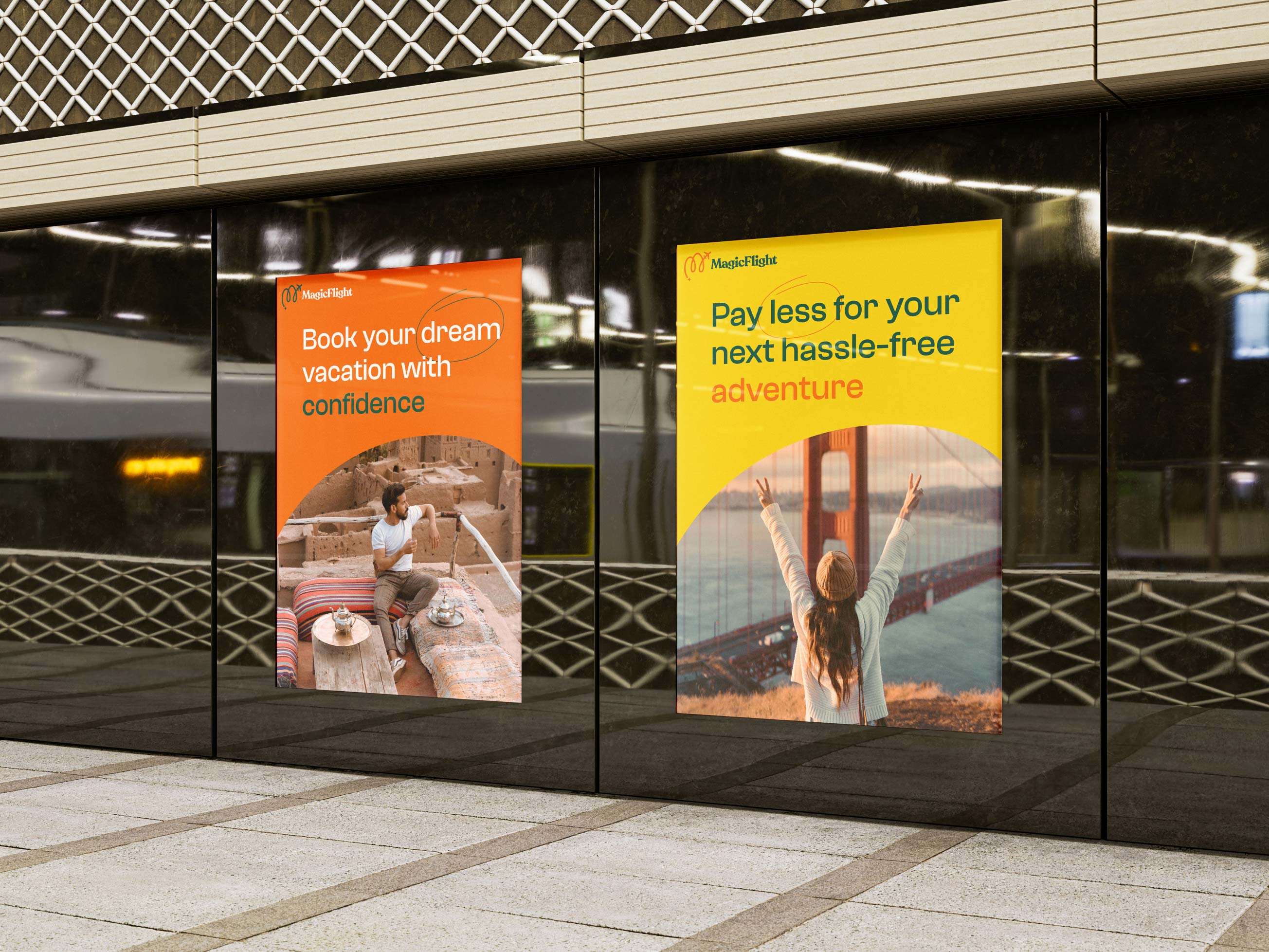
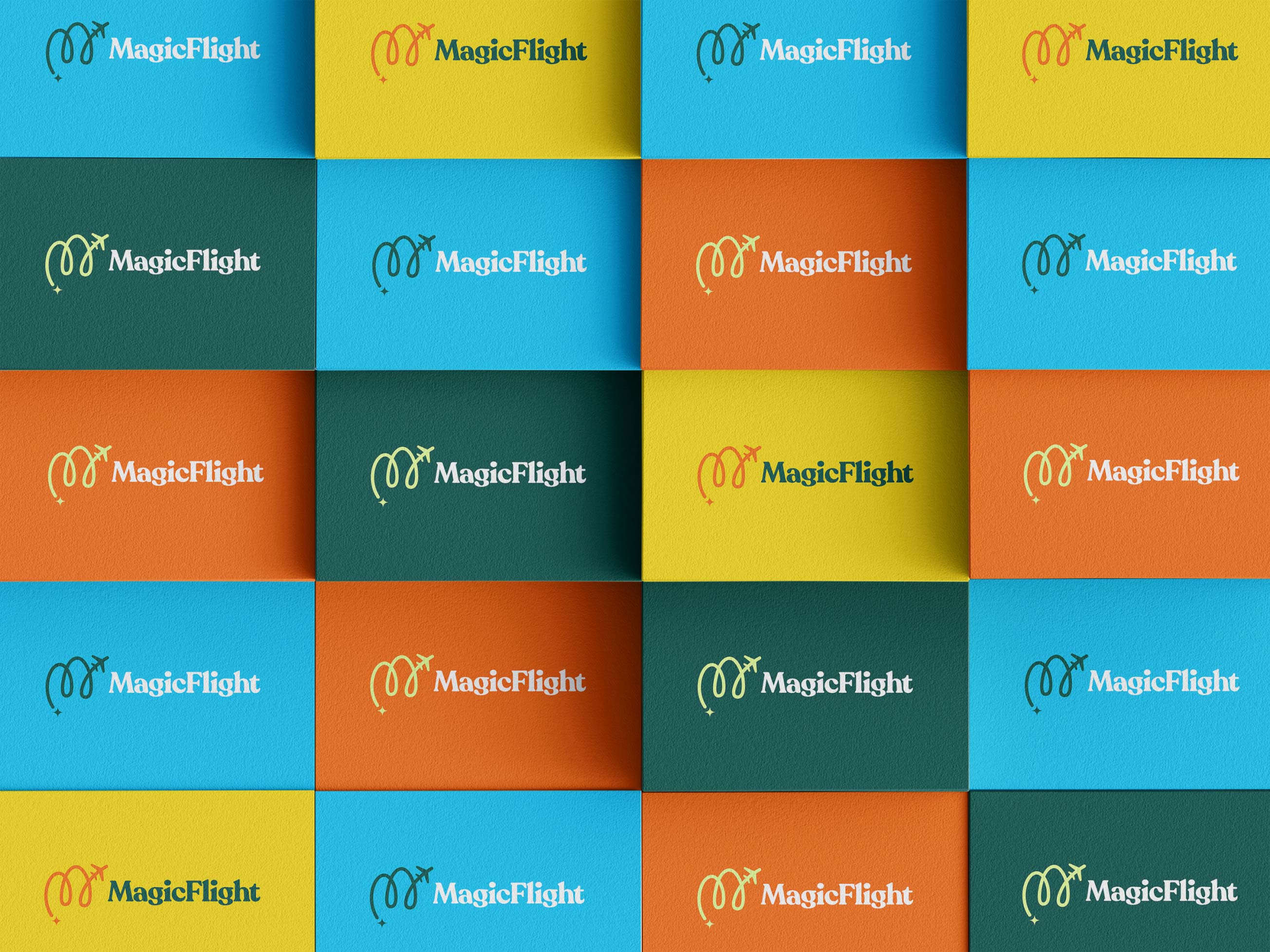
MagicFlight provides its users with the service of informing them about the reduced prices of the desired flights. The entire service, as well as the brand on which the service is reflected, is focused on the starting point of the journey, and the journey to the destination. The adopted logo basically represents these two elements, the beginning of the journey and the flight to the destination in the form of a graphically constructed latin letter "M". In the very process of creation, I came up with several very interesting solutions for the logo symbol, which I will also present in this case study.
The very beginning of the project was particularly demanding because it did not have a project specification nor was it supported by a vision to organise it. Taught by previous experiences, I realised that the very beginning should be an extensive research of all interactive and functional groups of the application. In this way, it was much easier to spot, count and improve all functional elements, such as buttons, form selectors and other similar elements, which later made up a comprehensive design system. It was easier also to manage and improve the user experience in the parts of the application that are crucial for users, and which presented great difficulties and created problems such as registration, booking meetings, creating and editing user profiles, participating in online and hybrid sessions, video meetings, video conferences.
Project Credits
Project Services
Logotype Design, Brand Development, Brand Guidelines
Project Team
Danijel Snjegota, Sina Sadegh
Project Role
Multimedia Designer